We partnered with the Noel Pointer Foundation (NPF) to strategically refresh their brand identity and website, ensuring they could retain current students while attracting new ones during their transition to a new location. This comprehensive rebrand—including a new logo, color palette, and website—captures the organization’s growth, vision, and unwavering commitment to excellence in arts education, while strengthening its connection to the community it serves.
The team at HD Made brought a wealth of patience, talent, and vision to the table, culminating in a new logo and dynamic new website that exceeded all expectations.
Chinita Pointer — Noel Pointer Foundation CEO & President
The goal of the logo redesign was to reimagine their logo while honoring the legacy and vision of their namesake. The updated design preserves the signature blue hue, a color deeply symbolic to the Foundation’s mission and identity while also modernizing the violin element, ensuring it remains clean and instantly recognizable across all applications and sizes. The result is a contemporary yet timeless logo that reflects the Foundation’s dedication to nurturing young musicians.
After a comprehensive competitor analysis and stakeholder interviews, we also expanded NPF’s color palette so it successfully captures the essential colors present in the new Brooklyn facility while adding touches of depth, elegance, creativity, and emotional intensity, representing the essence of Jazz music.
Our final task was to redesign the Noel Pointer Foundation’s website, ensuring it could better serve students, parents, and donors. Through a strategic process, we refined the site’s navigation and shifted its focus to a more visual, user-friendly experience that highlights the Foundation’s mission and the inspiring stories of its students. The goal was to create a platform that reflects the organization’s growth and commitment to arts education while making it easier for users to connect with and support their programs.
The original website was text-heavy and difficult to navigate, making it hard for users to find essential information or register for classes. Long scrolls of dense content overwhelmed visitors, and the lack of clear structure led to frustration for students and parents trying to access schedules or program details. The site’s design didn’t fully convey the vibrancy of the Foundation’s work or its deep connection to the community.
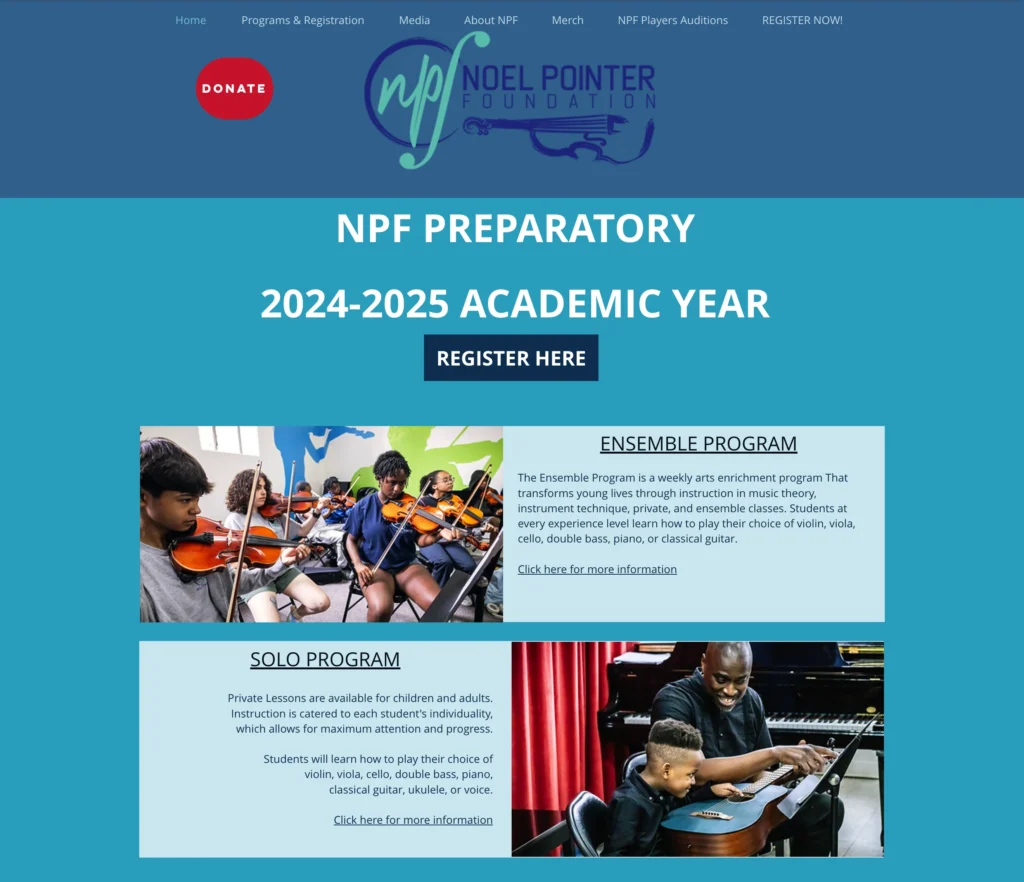
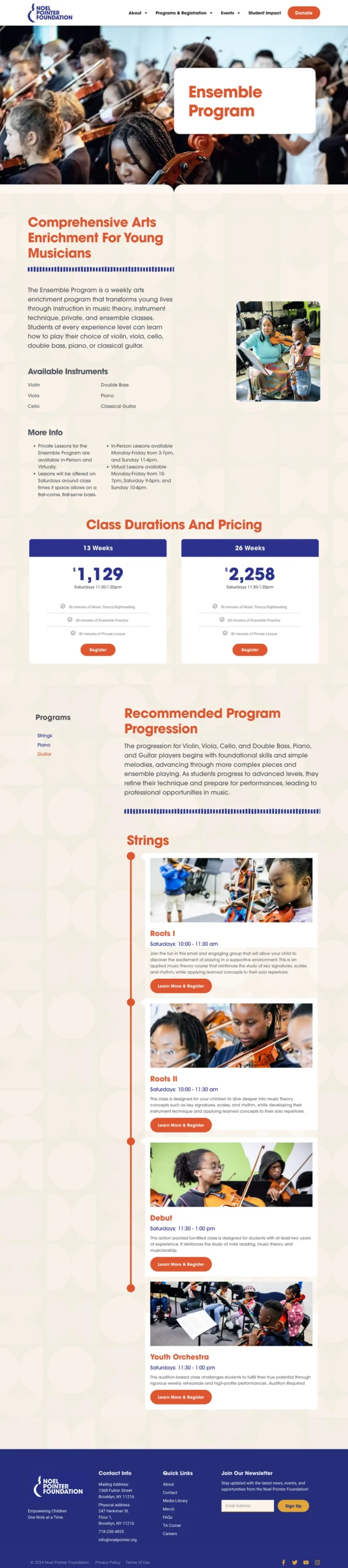
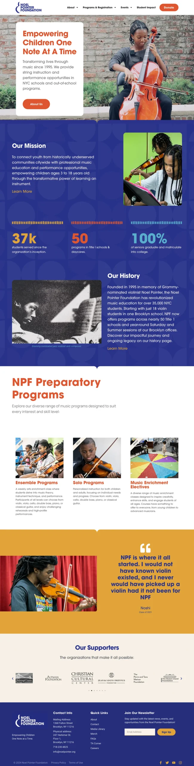
In the redesign, we streamlined the navigation to make it intuitive for users to find key information quickly. By reducing text and incorporating bold visuals, we created a more engaging and approachable experience. The new design prominently features students’ stories and photos, showcasing the impact of the Foundation’s work. With clear calls to action for registration and donations, the updated website has improved user engagement, making it easier for families to join programs and donors to support the mission.
© 2025 HD MADE Inc. All Rights Reserved.