Equity NYC

We partnered with NYC to design a platform that allows New Yorkers to examine socioeconomic, environmental and physical health disparities across New York City.

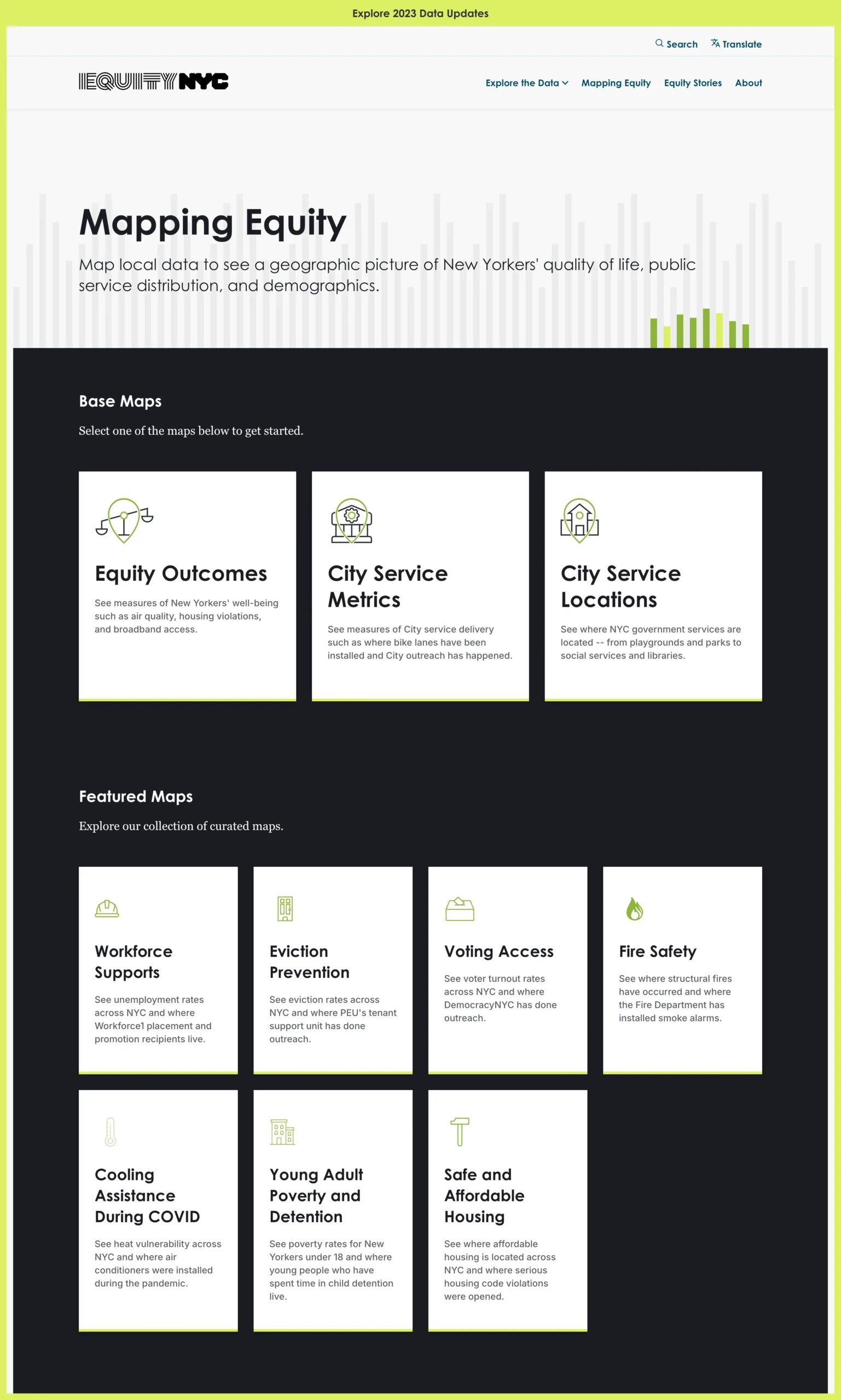
As detailed in Executive Order 45, New York City’s Opportunity Department is committed to increasing transparency and accessibility of city data to empower residents, city agencies, advocacy groups, and public officials. Equity NYC, a key initiative under Ops, is an interactive platform that enables users to explore the economic, social, environmental, and physical health of New York City across race/ethnicity, gender, sexual orientation, location, and income. The platform offers a range of features, including data visualizations, interactive maps, and compelling data stories, to foster greater understanding and accountability in government services and policies.

Challenges

  • Complex and Vast Data Sets: With multiple indicators spanning demographics, education, healthcare, and economic development, structuring and presenting data in an intuitive manner was a significant challenge.
  • User Accessibility: Making the data meaningful and accessible to diverse stakeholders, from policy experts to everyday residents, required a user-centered design approach.
  • Disparate Apps and Data Sources: The Equity portal was served by two separate apps and data sources. The first one was a React main app using Postgres SQL as the data source and a React Maps app using Carto database as the data source. So, one of the main challenges was to merge the data sources for a smooth maintenance and user experience. Global search was not possible due to different data sources. Also, content admins had to upload data at two different data sources.
  • Geospatial Representation: Ensuring accurate and effective visualization of geographic disparities across boroughs and neighborhoods was a priority.

Key Features and Innovations

Interactive Map Tool

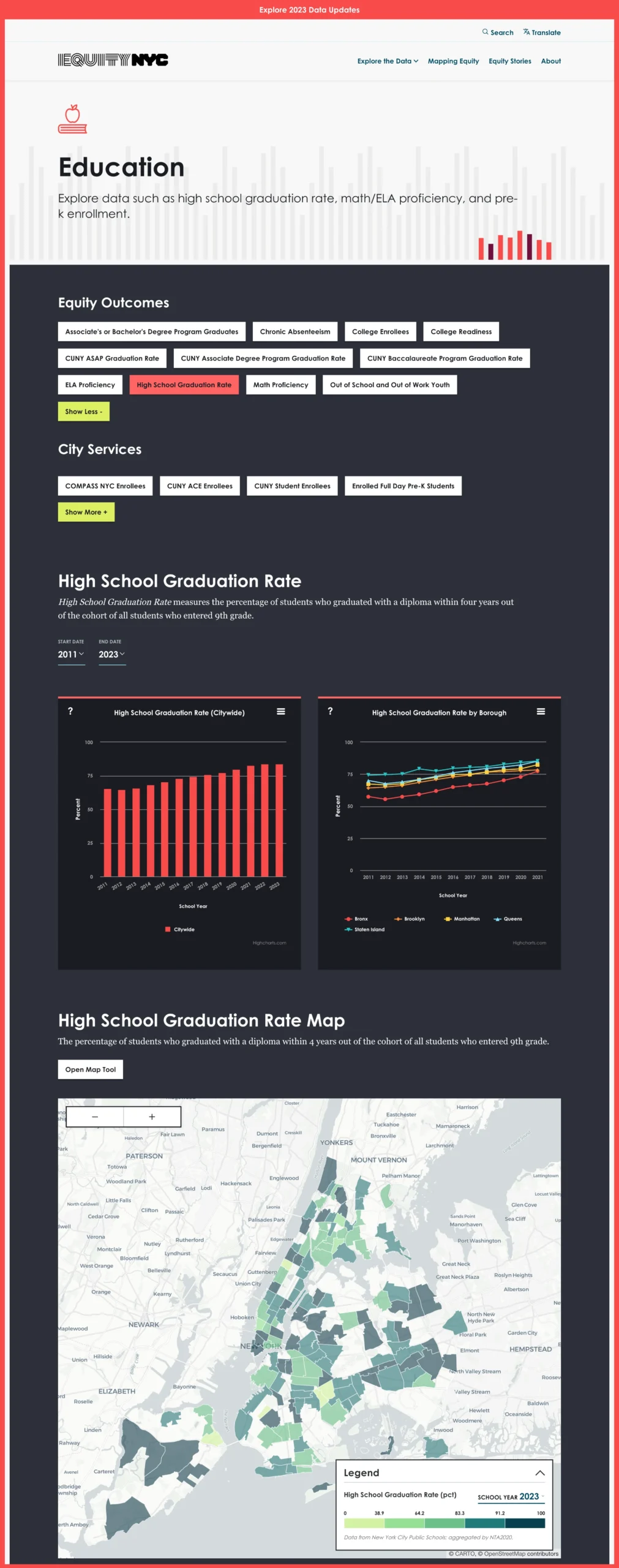
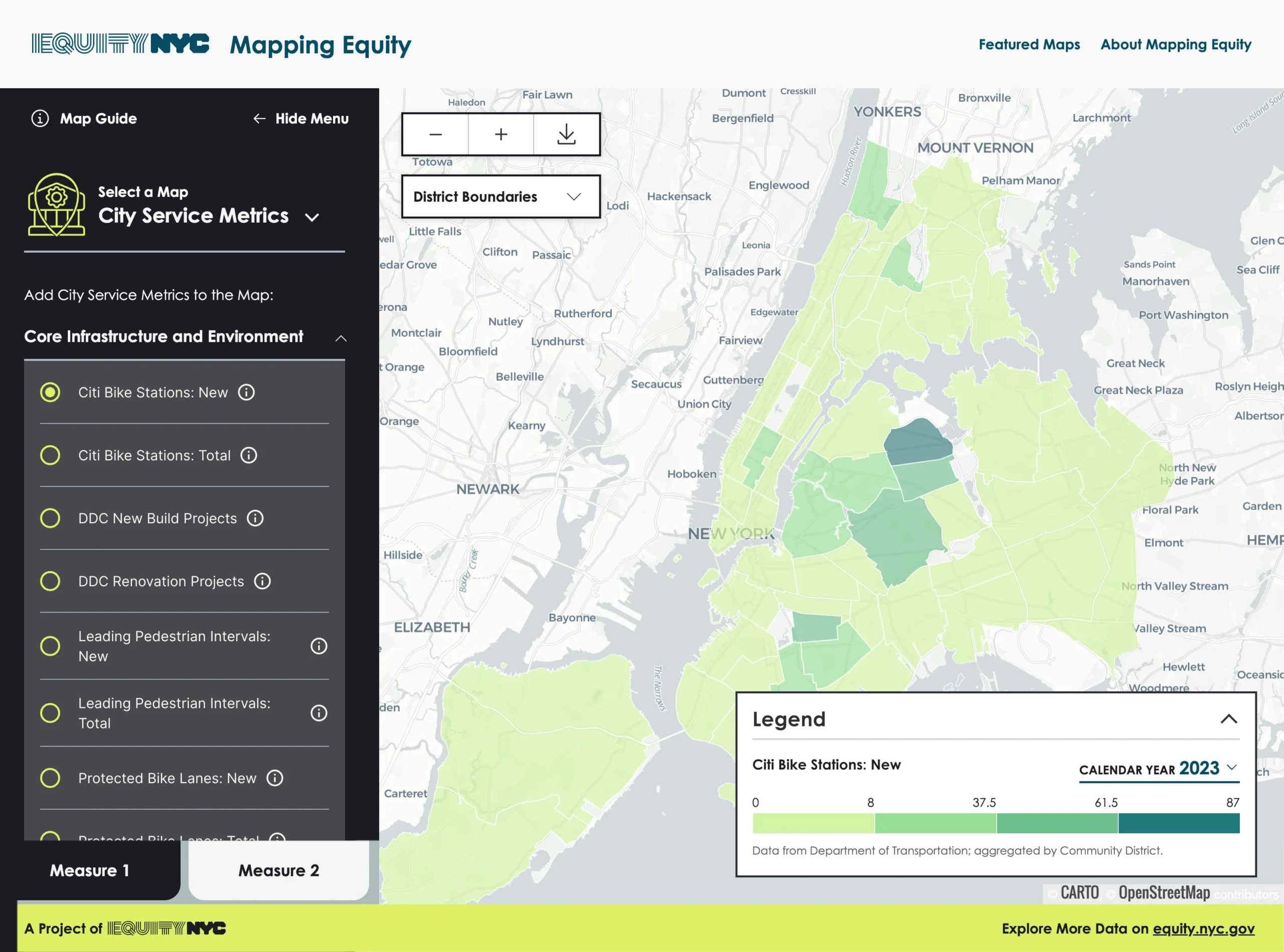
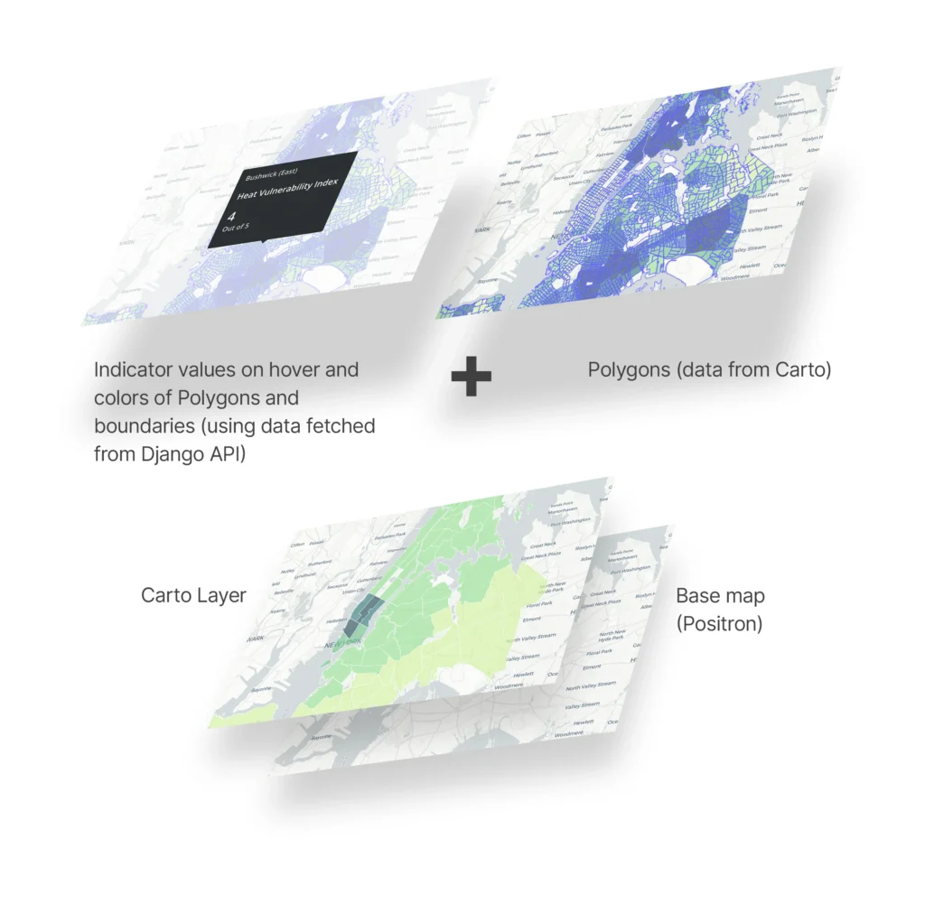
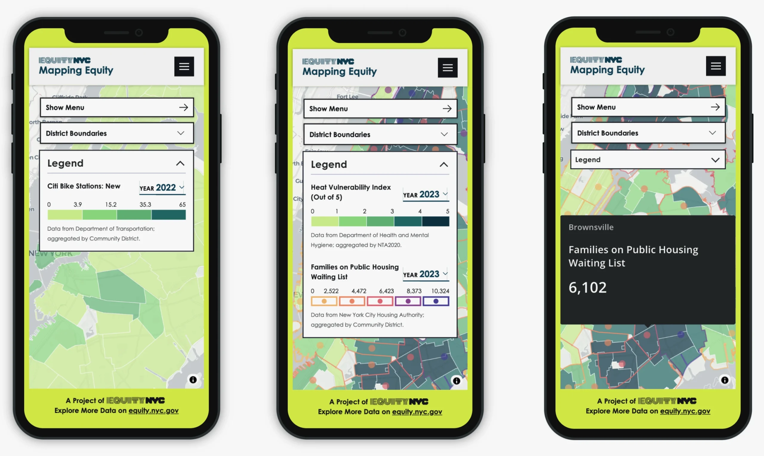
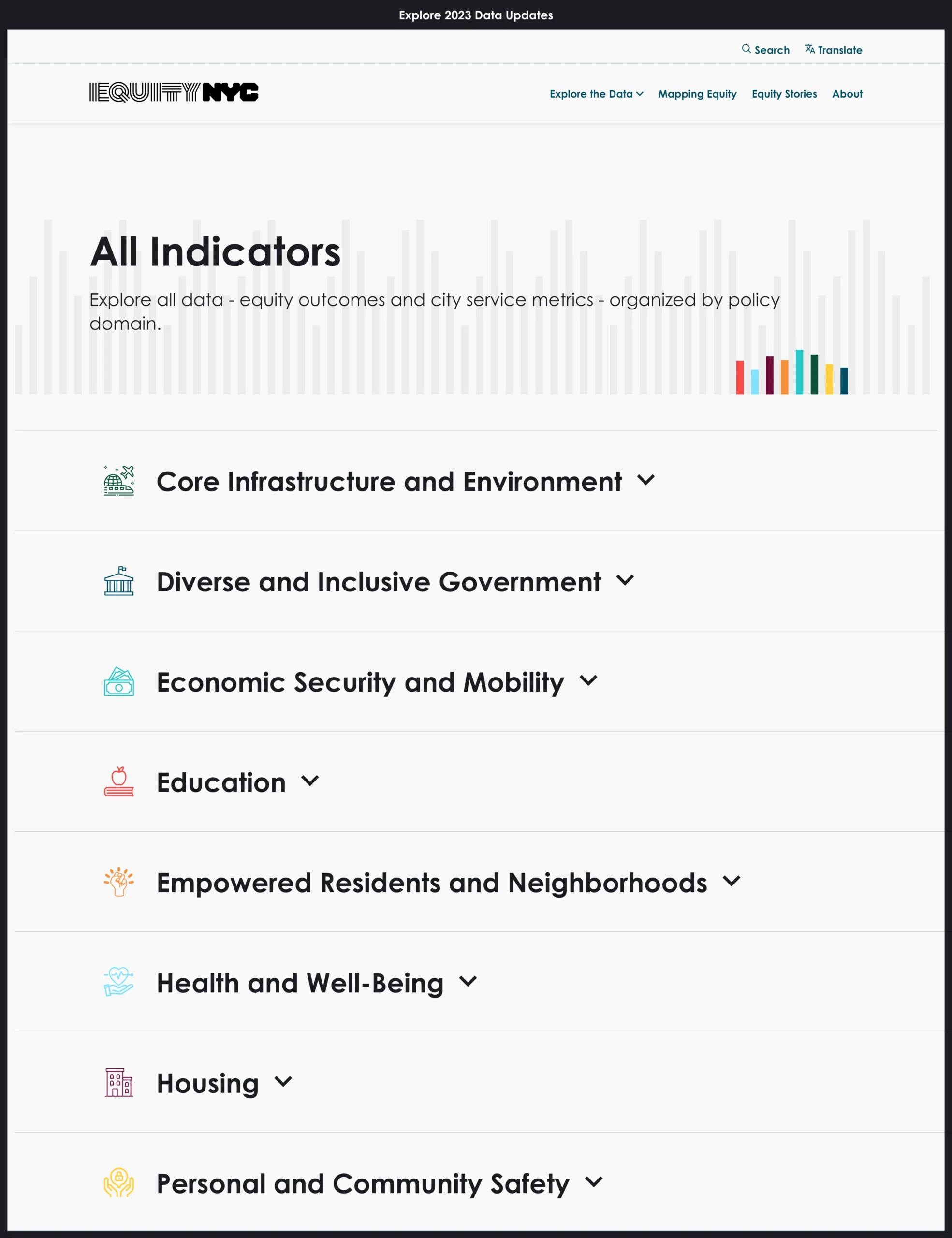
Equity NYC’s interactive mapping tool provides users with a comprehensive view of indicator data across multiple domains. The tool uses base maps and polygon layers from a Carto database, and customizes the maps to display indicator values, colors of polygons and polygon boundaries from the app’s AWS RDS backend database.

Interactive Map Tool

Equity NYC’s interactive mapping tool allows users to uncover correlations and trends by comparing two different indicators simultaneously. 

  • Provides a geographic picture of New Yorkers’ quality of life, public service distribution, and demographics.
  • Users can overlay multiple datasets to analyze relationships and visualize disparities between indicators.
  • Polygon overlays help to understand borough- and neighborhood-level insights.

Global Search (Single Data Source)

The Practical Logix team was able to develop a global search by merging the Carto database and the Postgres SQL database (AWS RDS). Content Admins or Data Managers are able to upload all the data (including both indicators’ data and map data) to the Django CMS and that is then stored in the AWS RDS.

Data Stories for Contextual Insights

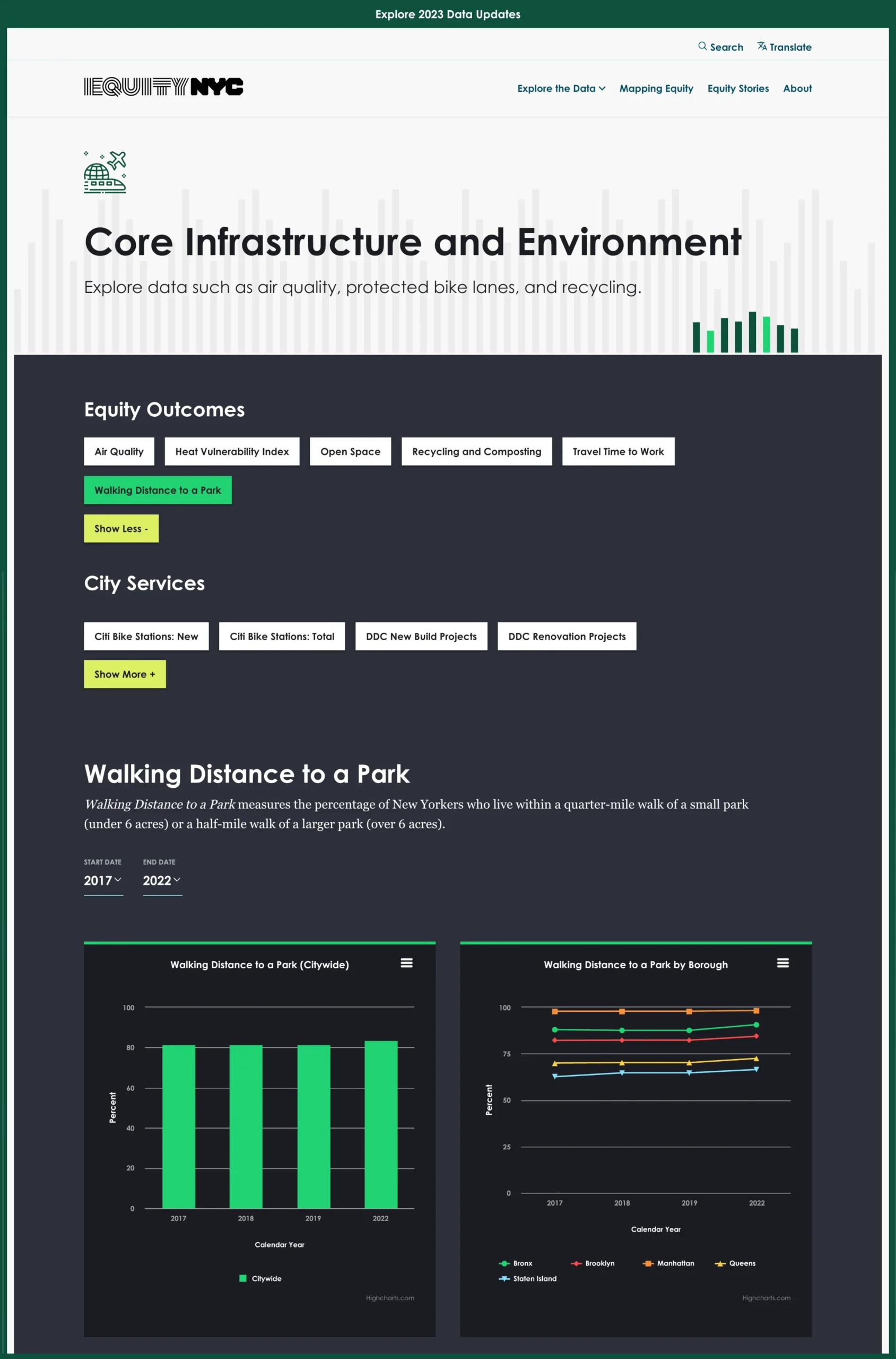
Equity NYC goes beyond raw numbers by incorporating data stories that provide context and narrative to key statistics.

  • These stories highlight trends, challenges, and policy implications, making data more relatable and actionable.
  • The storytelling approach enhances public engagement by translating complex data into digestible insights.

Comprehensive Data Analysis and Optimization

  • Equity NYC aggregates data from over 55 diverse government agencies to offer a holistic view of equity across NYC.
  • Users can track historical trends to understand progress or setbacks in various equity-related areas.
  • There are about 45 Equity outcomes organized across eight domains and cut across the responsibilities of city agencies.

User-Centric Design for Accessibility

  • Simplified navigation enables users to filter and compare data effortlessly. 
  • Downloadable datasets provide researchers and policymakers with easy access to raw data for further analysis.
  • Mobile-friendly interface ensures that users can engage with the platform on any device.

Outcomes and Impact

Transparency and Accountability

  • Residents and policymakers can access detailed, up-to-date equity data across multiple sectors.
  • Agencies can track their performance and adjust policies based on real-time insights.

Enhanced Public Engagement

  • The platform’s interactive tools and data stories make information more accessible and engaging for the general public.
  • Advocacy groups can leverage data to support policy changes and community initiatives.

Data-Driven Policy Making

  • City officials can use insights from the platform to drive equitable policies and resource allocation.
  • Real-time comparisons allow for proactive decision-making and targeted interventions.

Conclusion

Equity NYC is a leading example of how open data can create significant change. The platform combines advanced mapping tools, data narratives, and analytics to empower New Yorkers to advocate for equity and hold the government accountable. As Equity NYC develops, it becomes a role model for other cities looking to improve transparency and public engagement through data-driven solutions.